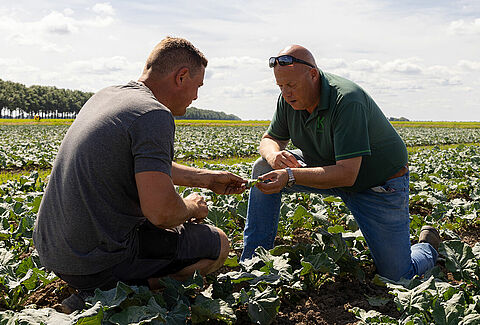

Introducing our new product branding
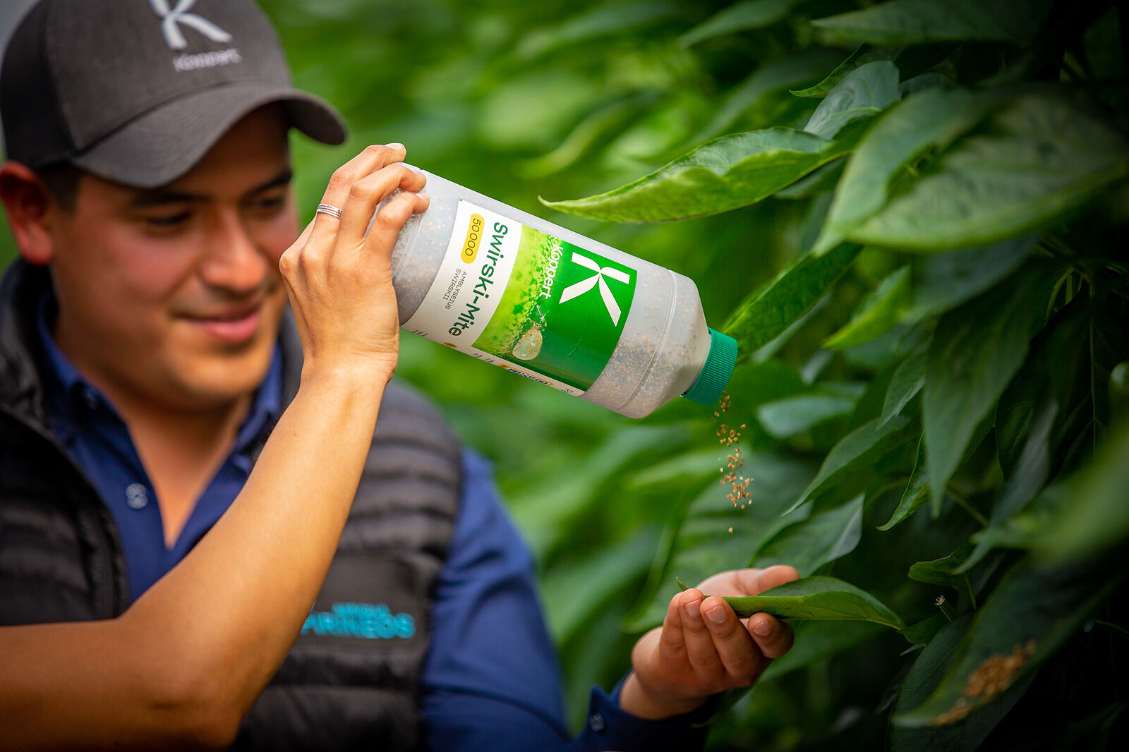
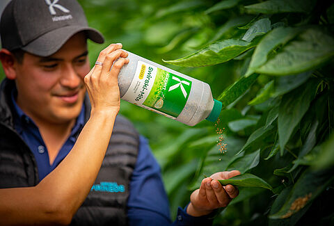
After introducing our new corporate branding in January 2022, it's time for the next phase. Over the coming months, we will be introducing our new product branding and packaging. Starting with our beneficial insects and predatory mites, and followed by additional product ranges each month.
The new product branding is more than a refresh. We've developed a recognizable look and feel across the entire product portfolio. It reflects our connectivity with nature and the high quality of our products. The beautiful photography and use of green as our main color bring our products to life. Even more importantly, our new product branding is designed with growers in mind. We are dedicated to helping growers support, protect and strengthen their crops with an integrated system of natural solutions. That's why we included several practical features to help simplify the daily use of our products.
Supportive colors
A range of supportive colors makes each product easily recognizable. This can be helpful when sorting a delivery consisting of different products. And for customers who use multiple products at once, it will be easier to navigate the products and methods they need to use to achieve the best results in crop protection.
Barcodes
Barcodes have been added to all packaging, enabling scanning and traceability throughout the logistics chain. For example, the datamatrix 2D barcode identifies the specific batch of a product. A QR code helps you navigate the product webpage directly for full product information.
Icons
In addition to the existing product icons that demonstrate the required storage conditions, a recycling icon was added to the design. This icon shows how to safely recycle our packaging, supporting sustainable waste flows.
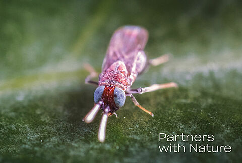
Inspired by Nature
Our mission is to work with nature and contribute to the health of people and the planet. The new branding was developed to reflect our mission and values. The Koppert' K' is designed to aim forward: we are always looking ahead for new sustainable solutions. In addition, the symmetry symbolizes the equal importance of plant protection above and underground. The natural shapes and colors express our connection with nature. Our new branding shows our dedication and commitment to providing biological solutions to produce healthy food most sustainably.